Crosstabs of Proportions (One Categorical Question by Another Categorical Question)
Most tables created in Q have the same basic structure: they show percentages and contain one question in the rows and one or more questions in the columns.
A gentle introduction to interpreting the default significance tests
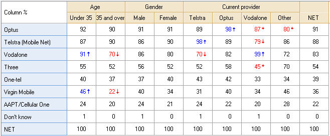
The table below shows a crosstab created by selecting a Categorical Question in the Blue Drop-down Menu and another in the Brown Drop-down Menu. The blue question is a Pick Any question showing aided awareness and the brown is a Pick Any question showing various profiling categories. The table is showing Column % and all the significance tests are conducted using this statistic (i.e., even if you change statistic, the test will still be a test of the Column %. The interpretation of the tests on this table is as follows:
- Age is a determinant of aided awareness. In particular, younger people are more likely to be aware of Vodafone and Virgin Mobile.
- Gender is not a determinant of aided awareness.
- Current provider is a determinant of aided awareness.
A more technical explanation
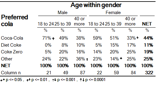
The next table is, in terms of how its significance tests are read, identical to the first. In this case it is showing a crosstab of a Pick One question, Preferred Cola, by a Pick Any question, Age within Gender.
The table below shows a table that has been exported to office.
 Preferred cola by Age within gender
Total sample; Unweighted; base n = 322; total n = 327; 5 missing
Multiple comparison correction: None (p = 0.05); Minimal sample size for testing: 2
The top-left corner of this table shows that amongst people in the sample that are both Male and aged 18 to 24, 71% prefer Coca-Cola. The arrow to the right of the 71% indicates that males aged 18 to 24 are more likely to prefer Coca-Cola than is typical in the adult population (i.e., this is the interpretation of a significance test). More specifically:
- The 71% observed amongst the males aged 18 to 24 is significantly different to the percentage preferring Coca-Cola amongst the rest of the sample (i.e., the percentage amongst the combined group of all the women, and, all the men aged 25 or more). The percentage amongst the rest of the sample is not shown on the table, but can be computed from the table as 42% (i.e., (49%×49 + 38%×87 + 59%×22 + 51%×59 + 33%×84)/(322 - 21)). Thus, the significance test compared 71% with 42%. Or, stated in slightly different language: each column is compared with its complement.
- The 71% observed amongst the 18 to 24 males is higher than the percentage observed amongst the rest of the sample (this is communicated by the direction of the arrow).
- The result is significant at approximately the 0.01 level (this is communicated by the arrow’s length). The 0.01 level of significance is equivalent to the 99% level of confidence.
The footer of the table contains additional information describing how the testing was conducted. It shows that: arrows have only been presented where tests have been significant at the 0.05 level; no tests were conducted involving groups with sample sizes of less than 2; and, that no multiple comparison correction was applied.
The color-coding in the table indicates statistical significance. A blue color indicates that the numbers are significantly 'high' and red that they are significantly 'low'. Arrows also indicate the statistical significance of the cells. The length of the arrow indicates the degree of statistical significance relative to the other cells in the table.
See also
- Independent Sample Tests - Comparing Two Proportions for a discussion of how Q computes the test.
- Interpreting Column Comparisons
