Visualization - Heatmap - Heatmap

A Heatmap color-codes values within a matrix, showing differences through variations in coloring. They are useful for visualizing differences, similarities, and trends across multiple variables.
Example
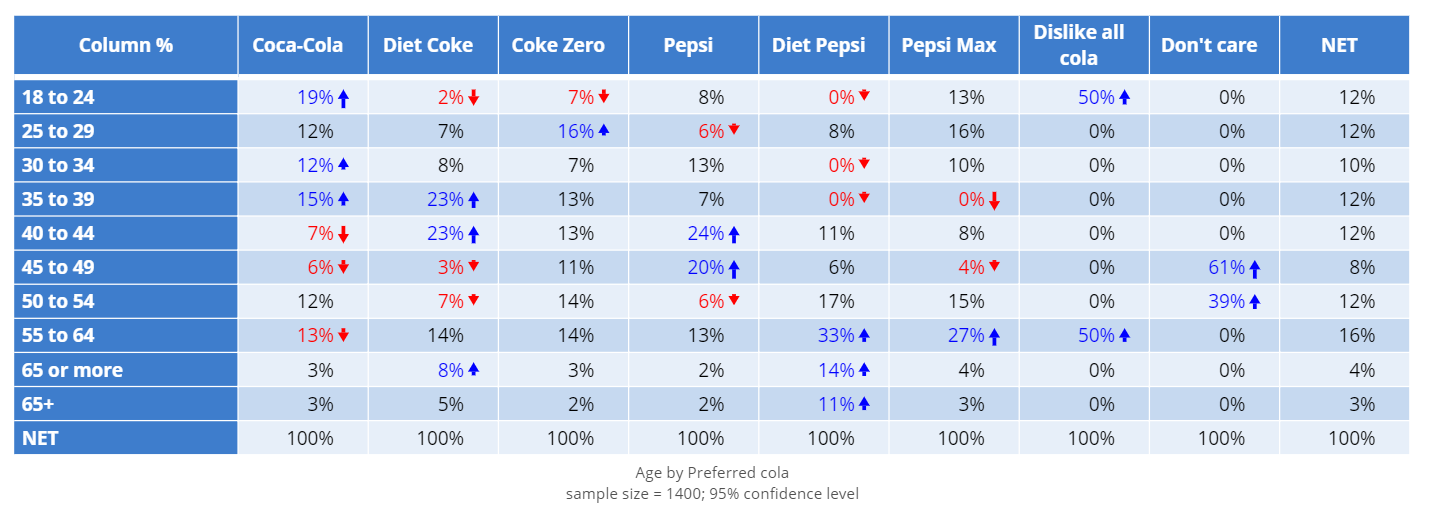
The examples below use data from a soft drink tracking study. The following visualizations use the table below, which shows the cola preferences of different age groups.

Basic Heatmap
Create a Simple Heatmap in Displayr
- 1. Go to Insert > Visualization > Heatmap
- 2. Under Inputs > DATA SOURCE > Output in ‘Pages’, select your table from the dropdown menu
Heatmap with Dendrogram
The following visualization is an extension of the heatmap shown above. A dendrogram is used to group rows and columns according to their similarities.
Create a Simple Heatmap in Displayr
- 1. Go to Insert > Visualization > Heatmap
- 2. Under Inputs > DATA SOURCE > Output in ‘Pages’, select your table from the dropdown menu
- 3. Under Chart > APPEARANCE > Row sorting or dendrogram, select Dendrogram
- 4. Under Chart > APPEARANCE > Column sorting or dendrogram, select Dendrogram
Object Inspector Options
The following is an explanation of the options available in the Object Inspector for this specific visualization. Refer to Visualization Options for general chart formatting options.
Chart
- APPEARANCE
- Row sorting or dendrogram Whether to sort rows by their averages in ascending or descending order.
- Column sorting or dendrogram Whether to sort columns by their averages in ascending or descending order.
- Shading standardization Whether to standardize the rows or columns to have means of zero and standard deviations of one before shading. This has no effect on the displayed cell values, only the colors.
- Left columns A list of tables to be appended to the left of the heatmap, matched by row names where present.
- Left column headings A comma separated string of headings for the appended left columns. If not supplied, the column names of the tables of Left columns are used.
- Right columns A list of tables to be appended to the right of the heatmap, matched by row names where present.
- Right column headings A comma separated string of headings for the appended right columns. If not supplied, the column names of the tables of Right columns are used.
Note that font family, color and sizes of left and right columns are linked to those settings for data labels and can be changed with Show data labels.
Acknowledgements
Uses the d3heatmap htmlwidget.
More Information
- How to create a heatmap in Displayr
- How to make a heatmap in Excel
- Heatmaps for the Display of Large Tables
- Coloring Heatmaps
- The problem with heatmaps
Code
{
    "formChartType": "Heat",
    "formStackSeries": false,
    "formSmallMultiples": false,
    "formAsPercentages": false,
    "formScatterLabelType": "As hover text"
}