Visualization - Geographic Map - Geographic Map

A Geographic Map (also known as a choropleth map) is a heatmap that uses geographical boundaries like regions, states, and countries. It is used to highlight geographical differences and similarities in data.
Data setup
The geographic map requires a table of two columns:
- Column 1: a list of geographic entities. The entities may be countries, continents, states, regions or zipcodes.
- Column 2: a data value for each geographic entity.
There are many ways to specify a geographic entity:
- Countries may be specified by name or a three-letter ISO code.
- US states can be referred to by their two-letter code; Australian states can be referred to by their acronym.
- Zipcodes and postcodes can be used for Australia, the UK, and the USA.
- USA regions can be used (i.e. Northeast, Midwest, South, West).
- SA4 Areas of Australia can be used.
- Note: It is not possible to plot a mixture of continents, countries, states, and regions.
The region you want to visualize will also affect which mapping package you should use:
- plotly: This option loads faster for more detailed maps. However, it may be limited for countries other than the US
- leaflet: This option offers continent maps and a wide range of single-country state maps.
For an exhaustive list of geographic entities available, use following R code:
- library(flipStandardCharts)
- CountriesOrContinents("country") # list the countries of the world
- CountriesOrContinents("continent") # list the continents
- StatesInCountry("Italy") # list the states in a country
- ZipcodesInCountry("UK") # list the zip/post codes in a country
- AreasInCountry("Australia") # list the areas in a country
Example
Geographic map with plotly
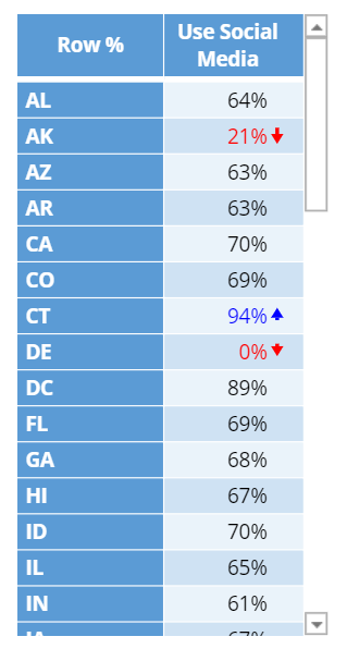
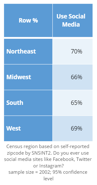
The examples below follow the same process but use different tables. They both visualize the rates of social media use in the USA, one by state and the other by region.
USA States - Social Media Usage
 |
USA Regions - Social Media Usage
 |
Create a Geographic Map (plotly) in Displayr
- 1. Go to Insert > Visualization > Geographic Map
- 2. Under Inputs > DATA SOURCE > Output in ‘Pages’, select your table from the dropdown menu
Geographic map with Leaflet
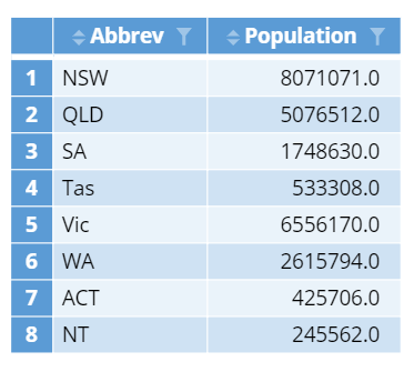
If you are dealing with geographic data from outside of the US, then leaflet is usually a better option. The following example visualizes the population of Australian states and territories.
 |
Create a Geographic Map (leaflet) in Displayr
- 1. Go to Insert > Visualization > Geographic Map
- 2. Under Inputs > DATA SOURCE > Output in ‘Pages’, select your table from the dropdown menu
- 3. Under Chart > Map Package, select leaflet
Object Inspector Options
The following is an explanation of the options available in the Object Inspector for this specific visualization. Refer to Visualization Options for general chart formatting options.
Chart
- APPEARANCE
- Map package Choice of which underlying package plots the map. This affects the look of the map, performance and the options available.
- plotly Faster for more detailed maps. Only USA is available for state or region maps.
- leaflet Offers continent and a wide range of single country state maps.
- Map package Choice of which underlying package plots the map. This affects the look of the map, performance and the options available.
- Treat NA as zero Whether missing values should be treated as having zero value or a separate category.
- Color of NA values The color used for missing values (provided they are not treated as zero).
- Show missing regions Whether to plot regions that are not included in the input data (as NA). Only available for leaflet.
- High resolution Controls the level of detail for plotly maps and leaflet world maps only.
- Ocean color The color of the ocean or background.
- Background map Sets a contextual background map from OpenStreetMap. Only available for leaflet.
- Zip code country Sets the country for zip code (or postcode) data. Usually this can be left at the default of Automatic unless the data are ambiguous. Only available for leaflet.
More Information
- How to make a geographic map in Displayr
- How to set the zoom and position of geographic maps
- How to build a geographic dashboard with real-time data
Acknowledgements
Australian postcode maps are based on Australian Bureau of Statistics data.
UK postcode maps are based on data from www.opendoorlogistics.com.
Code
{
    "formChartType": "Geographic Map",
    "formStackSeries": false,
    "formSmallMultiples": false,
    "formAsPercentages": false,
    "formScatterLabelType": "As hover text"
}