Visualization - Exotic - Palms

Palm Trees can condense a lot of information into a two-dimensional visualization, making them useful for visualizing multivariate data. There are two parts to each palm tree: the stem and the fronds (leaves).
Interpretation
The length of each frond (leaf) refers to an individual score, while the stem length refers to the overall score.
Stem length The stem length denotes the overall score based on the variables included in the visualization. To exclude a variable, click on the frond or the legend or turn it off in the legend. The stem lengths will automatically adjust to the new list of variables.
Frond length The fronds are color-coded and positioned the same way for each palm tree, allowing for easy comparison. The lengths of the frond denote the scores for each variable.
Note: hovering over a palm tree will show you the exact scores for each variable.
Example
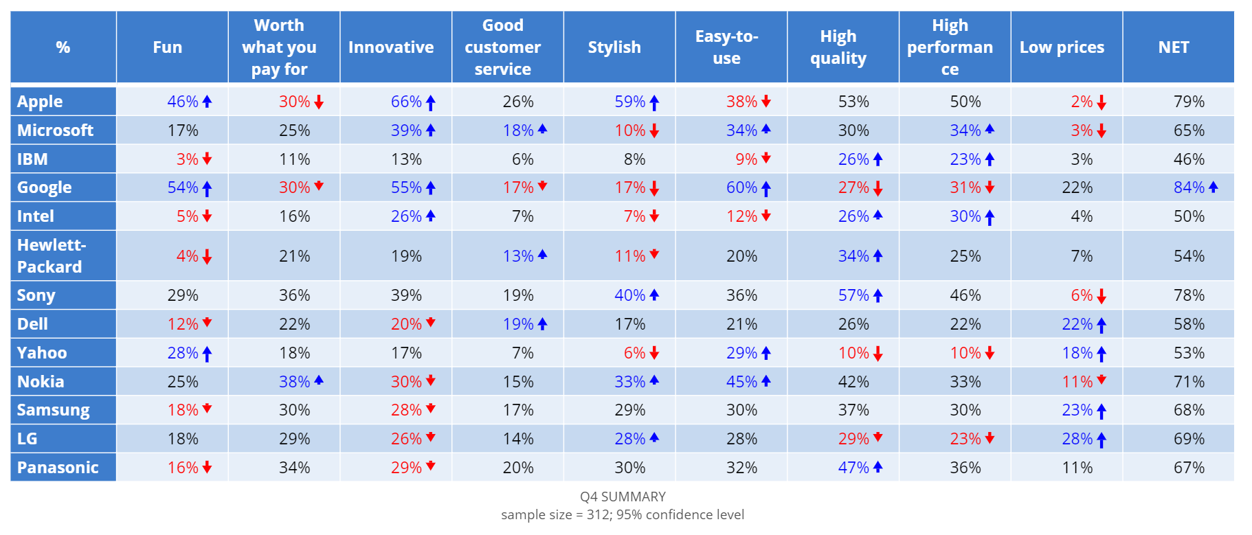
The following example uses data from a brand association survey of major tech companies. The palm tree chart is based on the table below, which shows whether companies are associated with positive brand attributes, like ‘fun’, ‘stylish’, and ‘innovative’.
Create a Palm Tree Chart in Displayr
- 1. Go to Insert > Visualization > Palm Tree Chart
- 2. Under Inputs > DATA SOURCE > Output in ‘Pages’, select your table from the dropdown menu
Object Inspector Options
The following is an explanation of the options available in the Object Inspector for this specific visualization. Refer to Visualization Options for general chart formatting options.
More Information
Acknowledgements
- Palm trees are programmed in R and d3 (HTMLwidgets).
- The original idea is from OECD Better Life Index.
Code
{
    "formChartType": "Palm",
    "formStackSeries": false,
    "formSmallMultiples": false,
    "formAsPercentages": false,
    "formScatterLabelType": "As hover text"
}
