Visualization - Distributions - Box

Box plots, also known as box-and-whisker plots are used to compare the distributions of different groups. The range of the box indicates the interquartile range of the data and the central line denotes the median (i.e. five-number summary).
Example
The example below uses data from a fast-food tracking study. The box plot shows the distribution of fast food consumed for different age groups.
>
Create a Box Plot in Displayr
- 1. Go to Insert > Visualization > Box Plot
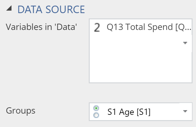
- 2. Under Inputs > DATA SOURCE > Variables in ‘Data’, select the variable you want to examine
- 3. Under Inputs > DATA SOURCE > Groups, select the variable to split your data
Object Inspector Options
The following is an explanation of the options available in the Object Inspector for this specific visualization. Refer to Visualization Options for general chart formatting options.
Chart
- APPEARANCE
- Plot vertically Rotates the plot by 90 degrees.
- Data value color Sets the color of the Box points as described below.
- Box points Treatment of outliers:
- All plots all of the values, next to the boxes.
- Suspected outliers plots all the unique values that appear outside the whiskers, using hollow circles for points less than 3 times the interquartile range from the 1st and 3rd quartiles.
- Outliers plots all the unique values that appear outside the whiskers.
- Box points Treatment of outliers:
Note that the quantiles and median shown in the box plot can differ from those shown in the violin plot. Quantiles in the box plot are computed using the midpoints between the steps of the empirical cdf as knots. This is equivalent to quantile(x, type = 5) in R, or Method 10 in http://jse.amstat.org/v14n3/langford.html.
More Information
Acknowledgements
The density is computed using the base R density function and the plot is created using plotly.
Code
{
    "formChartType": "Box",
    "formStackSeries": false,
    "formSmallMultiples": false,
    "formAsPercentages": false,
    "formScatterLabelType": "As hover text"
}
