Visualization - Bar - Bar

A Bar Chart presents categorical data with horizontal rectangular bars representing values or proportions. They are useful for visualizing discrete categories of data.
Examples
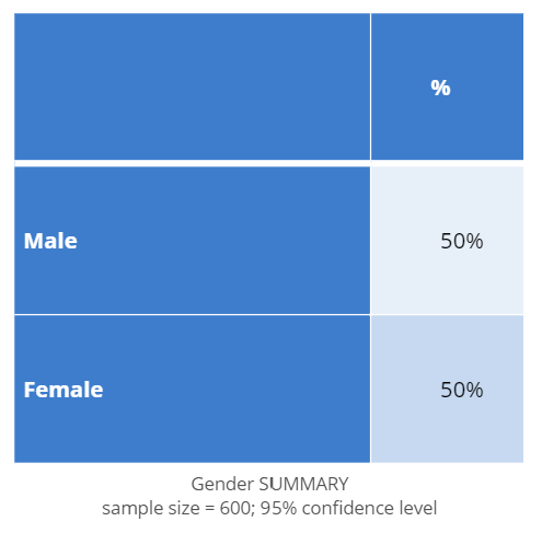
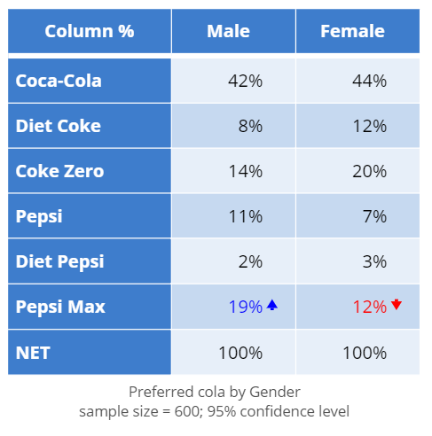
The examples below use data from a soft drink tracking study. The following visualizations show the cola preferences of respondents, using the following tables. The first table is used in the first example, and the second table is used for the remaining examples.
| Gender distribution table | Gender-Cola crosstab |
|---|---|
 |
 |
Basic Bar Chart
The simplest form of a bar chart is one that visualizes a single variable. The example below shows the proportion of males and females in a study.
Create a Simple Bar Chart in Displayr
- 1. Go to Insert > Visualization > Bar Chart
- 2. Under Inputs > DATA SOURCE > Output in ‘Pages’, select your table from the dropdown menu
- Note: If you don’t have a table, you can instead select variables from Inputs > DATA SOURCE > Variables in "Data"
Clustered Bar Chart
The Clustered Bar Chart compares the values of different categories of two or more groups, displaying grouped bars alongside each other. The example below shows the soft drink preferences of both males and females.
Create a Clustered Bar Chart in Displayr
- 1. Go to Insert > Visualization > Bar Chart
- 2. Under Inputs > DATA SOURCE > Output in ‘Pages’, select your table from the dropdown menu
Stacked Bar Chart
The Stacked Bar Chart is similar to the clustered bar chart, except the bars are stacked on top of each other rather than grouped side-by-side. The example below presents the same information as the clustered bar chart above, but it stacks and color-codes the values for males and females.
Create a Stacked Bar Chart in Displayr
- 1. Go to Insert > Visualization > Bar Chart
- 2. Under Inputs > DATA SOURCE > Output in ‘Pages’, select your table from the dropdown menu
- 3. Under Inputs > OUTPUT, check Stack series
100% Stacked Bar chart
A 100% Stacked Bar Chart rescales the values of each stacked bar so that they all add up to 100%, presenting the values as a proportion of the whole. The example below presents the stacked bar chart from above as a part-of-whole comparison.
Note that in the example below, the table the visualization is based on has the cell calculations set to Row %, rather than the default Column %. This lets us look at the proportions within each row, rather than each column. This option can be found in the Inputs > STATISTICS > Cells dropdown.
Create a 100% Stacked Bar Chart in Displayr
- 1. Go to Insert > Visualization > Bar Chart
- 2. Under Inputs > DATA SOURCE > Output in ‘Pages’, select your table from the dropdown menu
- 3. Under Inputs > OUTPUT, check Stack series
- 4. Under Inputs > DATA MANIPULATION, check Convert to percentages/proportions
Object Inspector Options
The following is an explanation of the options available in the Object Inspector for this specific visualization. Refer to Visualization Options for general chart formatting options.
Chart
- APPEARANCE
- Gap between bars Specify the amount of space between bars as proportion of the available space. Values can range from 0 (no gaps) to 0.99 (bars are shown as lines).
- Bar corner radius Specify the roundness of the bars as a proportion of the width of the bars. Values can range from 0.0 (sharp corners) to 0.5 (circular ends).
- DATA LABELS
- Minimum threshold to show data labels Data labels will be hidden in Stacked charts for values which are smaller than this proportion of the total range.
Object Inspector
- How to create a bar chart in Displayr
- How to create a bar chart in Excel
- Create a bar graph with an axis in the middle
- Customizing colors within a series on a bar chart
- Using sparklines to augment bar charts
Code
{
    "formChartType": "Bar",
    "formStackSeries": false,
    "formSmallMultiples": false,
    "formAsPercentages": false,
    "formScatterLabelType": "As hover text"
}