Principal Components Analysis Biplot
| Related Online Training modules | |
|---|---|
| Correspondence Analysis | |
| Generally it is best to access online training from within Q by selecting Help > Online Training |
A Principal Components Analysis Biplot (or PCA Biplot for short) is a two-dimensional chart that represents the relationship between the rows and columns of a table. In Q, PCA biplots can be created using the Maps dialog box, which generates the biplot in Excel or PowerPoint, or by selecting Create > Dimension Reduction > Principal Components Analysis Biplot, which generates an interactive version of the chart using R.
Required data
Any table that contains rows and columns, including contingency tables, grids (e.g., from a Pick Any – Grid question) and RAW DATA. The objects that are the focus of the analysis should be in the rows of the table. For example, if analyzing brand associations, the brands should be shown in the rows.
Statistic used in the analysis
When using the option in the Maps dialogue, Q computes the analysis using whichever of the following statistics is available on the table (where multiple are available, the one that appears first is used):
When using the R version, Q will use whichever statistic is shown in the table.
Interpretation
The principal components analysis biplot highlights the extent to which the objects represented by the rows differ in terms of the objects represented by the columns. Most commonly, where the rows are brands and the columns are attributes, the principal components analysis biplot shows the biggest patterns evident in the data in terms of how the brands differ in terms of the attributes.
Example 1
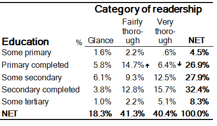
Consider the data shown below. In this example, the rows represent levels of education and the columns represent categories of readership of a magazine (source: Greenacre, Michael J. and Trevor Hastie (1987), "The Geometric Interpretation of Correspondence Analysis," Journal of the American Statistical Association, 82 (398), 437-47. The resulting principal components biplot is shown below.
Focusing just on the horizontal ordering of the chart (which is always the strongest pattern), note that the education levels have are in the order Secondary completed > Some secondary > Primary completed > Some tertiary > Some primary. Additionally, Secondary completed, Some secondary, and Primary completed lie on the right-hand side of the chart, towards the positions of the three readership categories; and Some tertiary and Some primary lie on the left, away from the positions of the readership categories. What this means is that, on average, Some tertiary and Some primary have similar response patterns and are below-average in terms of the readership categories. The opposite is true for the remaining three education levels. These facts are confirmed by looking at the original table.
Furthermore, the distance between the readership categories and the origin in the biplot show us that the categories Very Thorough and Fairly Thorough distinguish the educational groups more than the Glance category.
Finally, the small angle between the positions for Glance and Fairly Thorough shows us that those two categories have similar response patterns across the education groups.
Example 2
Consider the large image grid shown below and the resulting biplot shown underneath.
This chart allows us to see the associations between the brands and the image categories. We can see that the image categories Here today, gone tomorrow, Fashionable, Bureaucratic, and Don’t know much about them most strongly distinguish the brands. It also allows us to see patterns of correlation between the image categories. For example there is a correlation between Unreliable and Here today, gone tomorrow.
The biplot also allows us to see associations between the brands. For example Virgin mobile, Orange (Hutchison), AAPT, and New Tel each have similar response patterns, and are most strongly distinguished by Don’t know much about them. With regard to this category, Telstra (Mobile Net) is located far on the other side of the origin, and this indicates that has roughly opposite response patterns. In the table we can see that Telstra (Mobile Net) has the lowest score for this image category, whereas the other three are much higher.
Technical details
The PCA biplot can be produced using either the Maps dialogue, or as an R Output. Note that the output of the option in the Maps corresponds to the R Output with Normalization option set to Row principal.
The Maps option assumes that the focus of the analysis is on differences between rows in the input table. The R Output is more flexible, allowing different normalization schemes to be used. For example, the normalization should be set to Column principal if the focus of the analysis is more concerned with differences between the columns of the table. However, the Maps option may provide better integration with Microsoft Excel or Microsoft PowerPoint.
In both implementations, the principal coordinates are scaled by the square root of the singular values (i.e., by the standard deviations of the estimated components). The first component is given a scale of 1 and the second component’s scale is the ratio of the standard deviation of the second component divided by the standard deviation of the first. Some other statistics programs scale differently to Q. For example, R first scales by the standard deviation (rather than the ratio of the standard deviations) and then applies a second scaling to permit the row and column points to be charted in the same space. Although this changes the absolute magnitude of the numbers it does not change the interpretation (i.e., the relativities are equivalent), and the same conclusions will be drawn from the data regardless of the scaling.
