Visualization - Time Series - Time Series with Dynamic Window
(Redirected from Visualization - Time Series Graph)

The Time Series Graph visually displays a chronological series of data as an interactive dygraph. A range selector below the chart allows the user to focus on a particular time range. The input data may consist either of multiple series to be plotted on the same chart, or a single series with an upper and lower range (i.e. 3 values at each time point)
Example
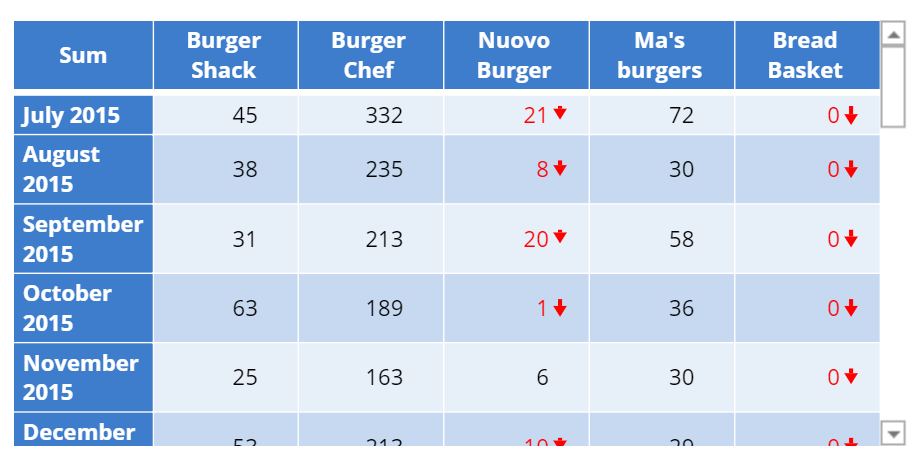
The example below uses data from a fast-food consumption survey. The visualization shows the popularity of fast-food chains over time.
 |
Create a Time Series Graph in Displayr
- 1. Go to Insert > Visualization > Time Series Graph
- 2. Under Inputs > DATA SOURCE > Output in ‘Pages’, select your table from the dropdown menu
Object Inspector Options
The following is an explanation of the options available in the Object Inspector for this specific visualization. Refer to Visualization Options for general chart formatting options.
Chart
- APPEARANCE
- Show range bars If checked, the data must consist of exactly 3 series. The series with the lowest and highest average values define the lower and upper bounds of the shaded region, as shown on the chart on the right above. The range is typically used to depict the extent of variation within each time step, or an amount of error or uncertainty.
- Window start (days from data end) The default start of the range window, in number of days before the end of the data.
- DATA SERIES
- Line thickness The width of the line connecting the data points.
More Information
Code
{
    "formChartType": "Time Series",
    "formStackSeries": false,
    "formSmallMultiples": false,
    "formAsPercentages": false,
    "formScatterLabelType": "As hover text"
}