Visualization - Time Series - Column with Trend Tests

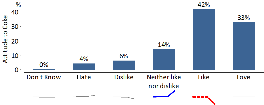
A column chart with trend can be used to show the relationship between a Date question and either a Pick One, Pick Any or Number - Multi question. An example is shown below.
The results from a particular time period are shown as columns. Significance tests, shown as arrows, compare the categorical period with the previous categorical period (see Tests Of Statistical Significance).
The lines below each column show how the result has changed over time. Lines that trend significantly upwards or downwards are color-coded, using the same method as for trend plots (see Significance Tests on Trend Plots).
Q 4.11 and Later
The time period and date range to use is selected by going to the Trend Lines section in the Chart settings to the right of the chart and changing the Aggregation and Period Type selections.
Older Versions of Q
The time period to use is selected by right-clicking on the columns, selecting Format All Series, and changing the settings in the Categorical Period tab.
The date range for the trend plots shown beneath are selected by right-clicking on the trend lines and selecting Format/Configure trends.
