Principal Components Analysis Loading Plot
| Related Online Training modules | |
|---|---|
| Correspondence Analysis | |
| Generally it is best to access online training from within Q by selecting Help > Online Training |
Principal Components Analysis Loading Plots are created using the Maps dialog box. You can also generate the coordinates using Principal Components Analysis.
Required data
A correlation matrix (i.e., a Number - Multi question selected in the blue drop-down menu and the same question selected in the Brown Drop-down Menu).
Interpretation
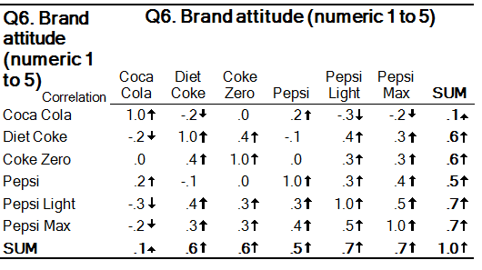
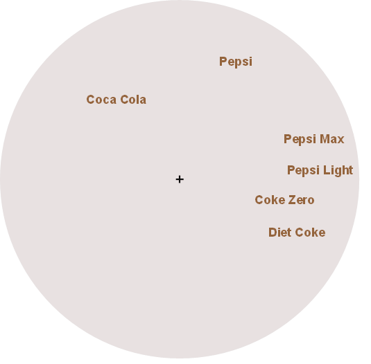
Variables that appear closer together on the chart are more highly correlated. Unlike with multidimensional scaling, with a principal components analysis loading plot the relationship between the points and the origin (i.e., point where the x and y axes are at 0) has meaning and it is useful to keep in mind when interpreting the chart that the underlying data is based on correlations. Consider the correlation matrix and the resulting principal components loading plot shown below.
Note that:
- The diet products are all clustered together and are relatively far from the origin (+), which tells us that they are all correlated (if they were clustered together but with the origin in-between, this would indicate that they were not correlated).
- Pepsi can be seen to be closer to the Pepsi diet brands than to any of the Coke brands, indicating a higher correlation between the different Pepsi brands, which is also evident in the data in the table.
- The angle between Pepsi, the origin, and Diet Coke is greater than 90 degrees, which indicates that there is a degree of negative correlation between them.
- Coca-Cola has negative correlations with all the brands other than Pepsi and this can be discerned from the chart by noticing that it for all bar Pepsi, the angle formed with the Origin is greater than 90 degrees.
- If looking only at the chart, you would assume that the strongest negative correlation is between Coca-Cola and Diet Coke, however, looking at the table we can see that although there is a negative correlation, it is not the strongest. The explanation for this is one of error. That is, the map is only charting two dimensions, but the data has six dimensions (i.e., variables) and thus the map gets some of the fine detail wrong as it can only show the main patterns.
Technical details
The chart is computed using principal components analysis and shows the loadings of the first two components (i.e., the correlations between the variables and the two largest components). The loadings have been multiplied by the standard deviation of the component (i.e., the square root of the eigenvalue), which has the effect of making it appropriate to view the data as distances (i.e., this multiplication is to recognize that the first component explains more of the variance of the data than the second).

