Visualization - Line - Sparkline Curve
(Redirected from Visualization - Sparkline - Curve)

The Sparkline - Curve feature creates a sparkline of a smoothed line chart. A sparkline is a small chart with axes and coordinates excluded. They are commonly used alongside more detailed visualizations or displayed inline with text.
Example
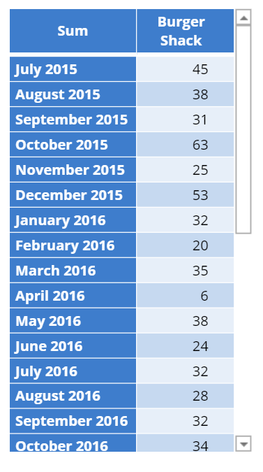
The examples below use data from a fast-food consumption survey. The following visualization is a sparkline of sales over time.
Create a Sparkline Curve in Displayr
- 1. Go to Insert > Visualization > Sparkline > Curve
- 2. Under Inputs > DATA SOURCE > Output in ‘Pages’, select your table from the dropdown menu
Object Inspector Options
The following is an explanation of the options available in the Object Inspector for this specific visualization. Refer to Visualization Options for general chart formatting options.
Inputs
- OUTPUT
- Chart type Curve
DATA SOURCE
- All input options supported the other visualizations can be used with Sparkline. However, only the first data series in the input data will be shown (i.e. the first column in a matrix, the first variable in a variable set, or the first level in a variable used as the Group). The user can use the COLUMN MANIPULATIONS to specify a data series to show.
Chart
- APPEARANCE
- Fill color Color of chart
- Fill opacity Opacity of the fill color is specified as a numeric between 0 (completely transparent) to 1 (opaque).
- Line width Width of the line on the boundary of the area chart. Set to 0 to hide line.
- Line color and opacity controls the appearance of the line in the Area chart.
- Show end points Whether or not to show markers (circles) at the end points of the line in a Line, Curve or Area chart.
- FONT
- Global font family Default font family to be used for all labels. This can be overriden for specific text elements.
- Global font color Default color for all text elements.
- Font units This can be set to pt (points) or px (pixels). By default, font sizes are specified in pt, which is consistent with font sizes specified in textboxes. It is occasionally more convenient to use px because dimensions of other outputs are frequently specified in pixels.
- END LABELS
- Show end labels Controls whether or not labels are show at the ends of the line (None); and whether the labels are place ::Above points, Below points or Next to points
- X AXIS & Y AXIS
- Show X/Y axis Show the axis line and ticks.
- Show X/Y axis tick labels When the axis is shown, the user can also choose whether or not include tick labels.
- Tick label font Controls the font family, color and size of the tick labels.
- HOVERTEXT
- Number type Controls the formatting of the tick labels. Choose one of Automatic, Number and Percentage
- Decimal places Controls the number of decimals shown in the tick labels.
- Hover number type Control the formatting of text shown when the cursor hovers above the chart. Choose one of Automatic, Number and Percentage
- Hover decimal places Controls the number of decimals shown in the hovertext.
- Hover background color Controls the color of the hover text box.
- BACKGROUND
- Transparent background By default the background is transparent. Unselect to specify a background color and opacity.
- Margins Specify space to be left around the chart in units of pixels. In most cases, margins will be automatically adjusted for the tick labels, but in certain cases, you may need to manually increase the margins to avoid tick labels being truncated.
Code
{
    "formChartType": "Curve",
    "formShowEndPts": false,
    "formEndLabPos": "None"
}
