Visualization - Distributions - Density
(Redirected from Visualization - Density Plot)
Jump to navigation
Jump to search
A Density Plot (also known as a density chart) is used to compare the distributions of one or more variables. They can be used to detect irregular distributions within a single variable, and compare densities between different variables.
Example
The example below uses data from a fast-food tracking study. The density plot shows the distribution of fast food consumed for different age groups.
Create a Density Plot in Displayr
- 1. Go to Insert > Visualization > Density Plot
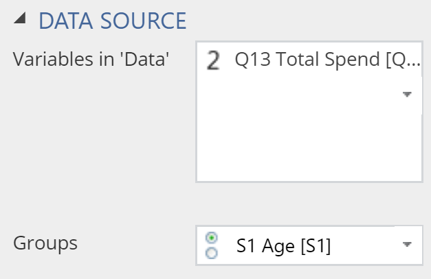
- 2. Under Inputs > DATA SOURCE > Variables in ‘Data’, select the variable you want to examine
- 3. Under Inputs > DATA SOURCE > Groups, select the variable to split your data
Object Inspector Options
The following is an explanation of the options available in the Object Inspector for this specific visualization. Refer to Visualization Options for general chart formatting options.
Chart
- APPEARANCE
- Plot vertically Rotates the density plot by 90 degrees.
- Plot the individual data value Creates a rug plot beneath the density plot, as shown in the example below.
- Data value color Sets the value of the dashes in the rug.
- Bandwidth The relative width of the bandwidth used to compute the density (the smaller the value, the 'bumpier' the plot).
- Automatically compute lower bound If selected, the left-side of the plot is set to the lowest value observed in the other data. Otherwise, it is set to be further to the left than this, so as to create a smooth end to the plot.
More Information
Acknowledgements
The density is computed using the base R density function and the plot is created using plotly.
Code
{
    "formChartType": "Density",
    "formStackSeries": false,
    "formSmallMultiples": false,
    "formAsPercentages": false,
    "formScatterLabelType": "As hover text"
}
