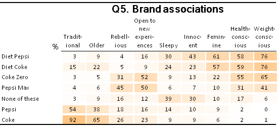
Creating a Heat Map (Shading Cells Proportional to Their Values)
Jump to navigation
Jump to search
Turns the table into a "heat map".
This example can be run in C:\Program Files\Q\Examples\Cola.Q (this may be located on a different place on your computer depending upon how Q was installed) using Q5. Brand associations by SUMMARY.
 // Get the name of the first statistic.
 var first_statistic = table.statistics[0];

 // Get the first statistic's values.
 var values = table.get(first_statistic);

 // Some cells should be ignored.
 var ignore_rows = [];
 var ignore_columns = [];
 if (first_statistic == 'Column %')
	ignore_rows.push(table.rowIndex('NET'));
 else if (first_statistic == 'Row %')
	ignore_columns.push(table.columnIndex('NET'));

 // Calculate the minimum and maximum values.
 var min, max;
 for (var row = 0; row < table.numberRows; row++)
	for (var column = 0; column < table.numberColumns; column++)
		if (ignore_rows.indexOf(row) == -1 && ignore_columns.indexOf(column) == -1) {
			var value = values[row][column];
			if (min == null && max == null) {
				min = value;
				max = value;
			} else {
				min = Math.min(min, value);
				max = Math.max(max, value);
			}
		}

 // Get the array of cell colors (currently blank, or white).
 var cell_colors = table.cellColors;

 for (var row = 0; row < table.numberRows; row++)
	for (var column = 0; column < table.numberColumns; column++)
		if (ignore_rows.indexOf(row) == -1 && ignore_columns.indexOf(column) == -1) {
			var value = values[row][column];

			// Get the current value as a scale proportion (0-1)
			var scale = (value - min) / (max - min);

			// Make sure the current value is not missing data or infinity,
			// which could arise if there is insufficient data on the table...
			if (!isNaN(scale) && isFinite(scale)) {
				// Create a color to represent where this value fits on the scale.

				// covertHSVtoRGB() is a built-in function that Q provides.

				// This varies the scale by saturation instead of hue:
				var color = convertHSVtoRGB(32, scale, 1);

				// Try and experiment using some different color schemes.

				// In this scheme,
				//  the lowest color has a hue of 240 (blue).
				//  the highest color has hue of 0 (red).
				// The beauty of the Hue, Saturation, Value (or Brightness) color space
				// means that changing the value of Hue proportionally makes the color
				// look 'hotter'.
				//var color = convertHSVtoRGB(240 * (1 - scale), 1, 1);

				// Set the color for this cell.
				cell_colors[row][column] = color;
			}
		}

 // Set the array of cell colors we just modified.
 table.cellColors = cell_colors;
Note that:
- By default, it uses shades of orange but it can be modified to so that shows low values as blue (cold) and high values are red (hot). This is done by commenting out (i.e., putting // in front of) the line var color = convertHSVtoRGB(32, scale, 1); and un-commenting-out (i.e. removing // from) the line // var color = convertHSVtoRGB(240 * (1 - scale), 1, 1);
- If you change it from a table to a Grid of Bars Plot it will shade that chart.
See also
- Creating Heat Map Plots
- Table JavaScript and Plot JavaScript for an explanation of how to run this code.
- Table JavaScript and Plot JavaScript Reference for technical information.
- Table JavaScript and Plot JavaScript Examples Library for other examples.
- JavaScript for information about the JavaScript programming language.
- QScript for tools for automating projects using JavaScript.
- JavaScript Variables for detail on how to create new variables in the Variables and Questions tab using JavaScript.
